BONI GLOBAL BRAND BOOK
BRANDING DESIGN
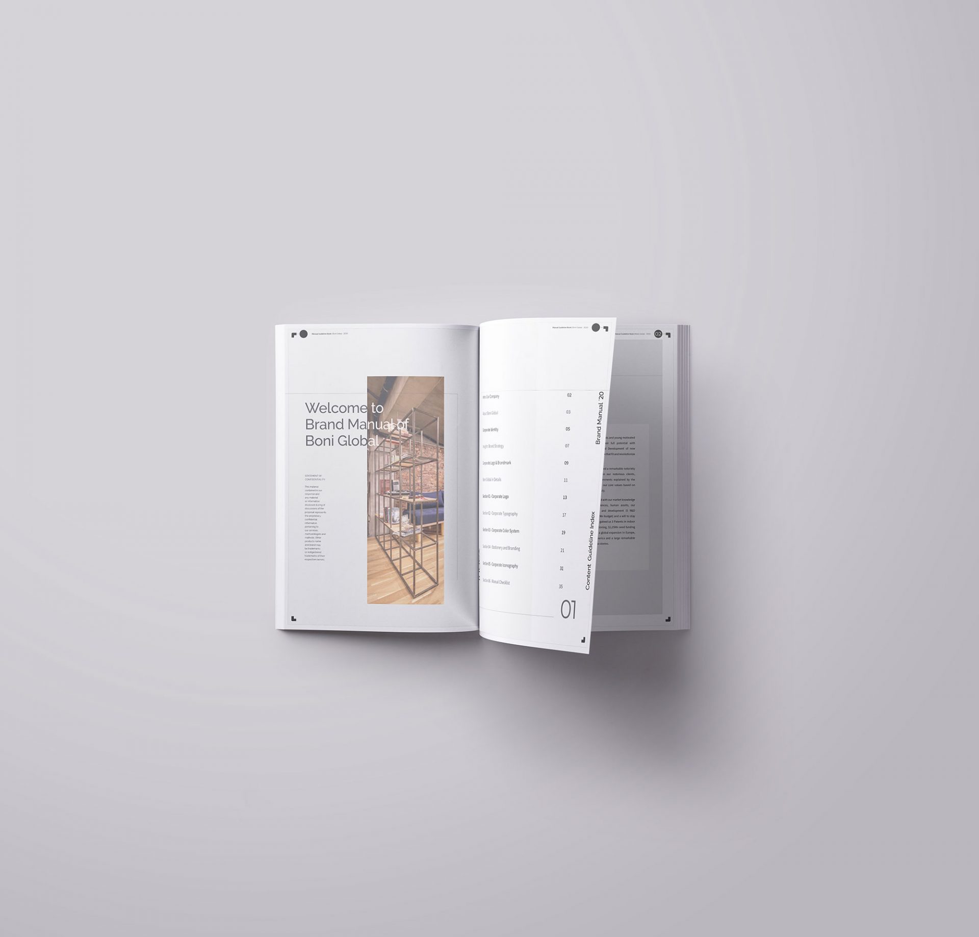
About Project
Boni Global is a company that has developed accessible software systems for people with visual and hearing impairments on international arena for a while. When I started working at the firm, there was concern about visual identity. Re-branding is an identity should be created from scratch suitable for the sector and the job and thus the process started.
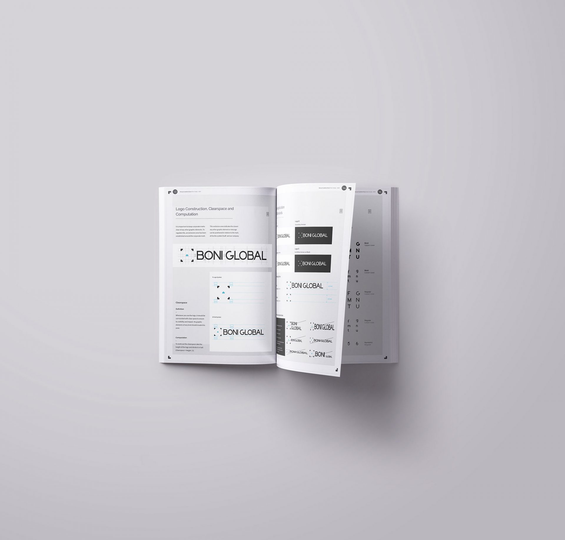
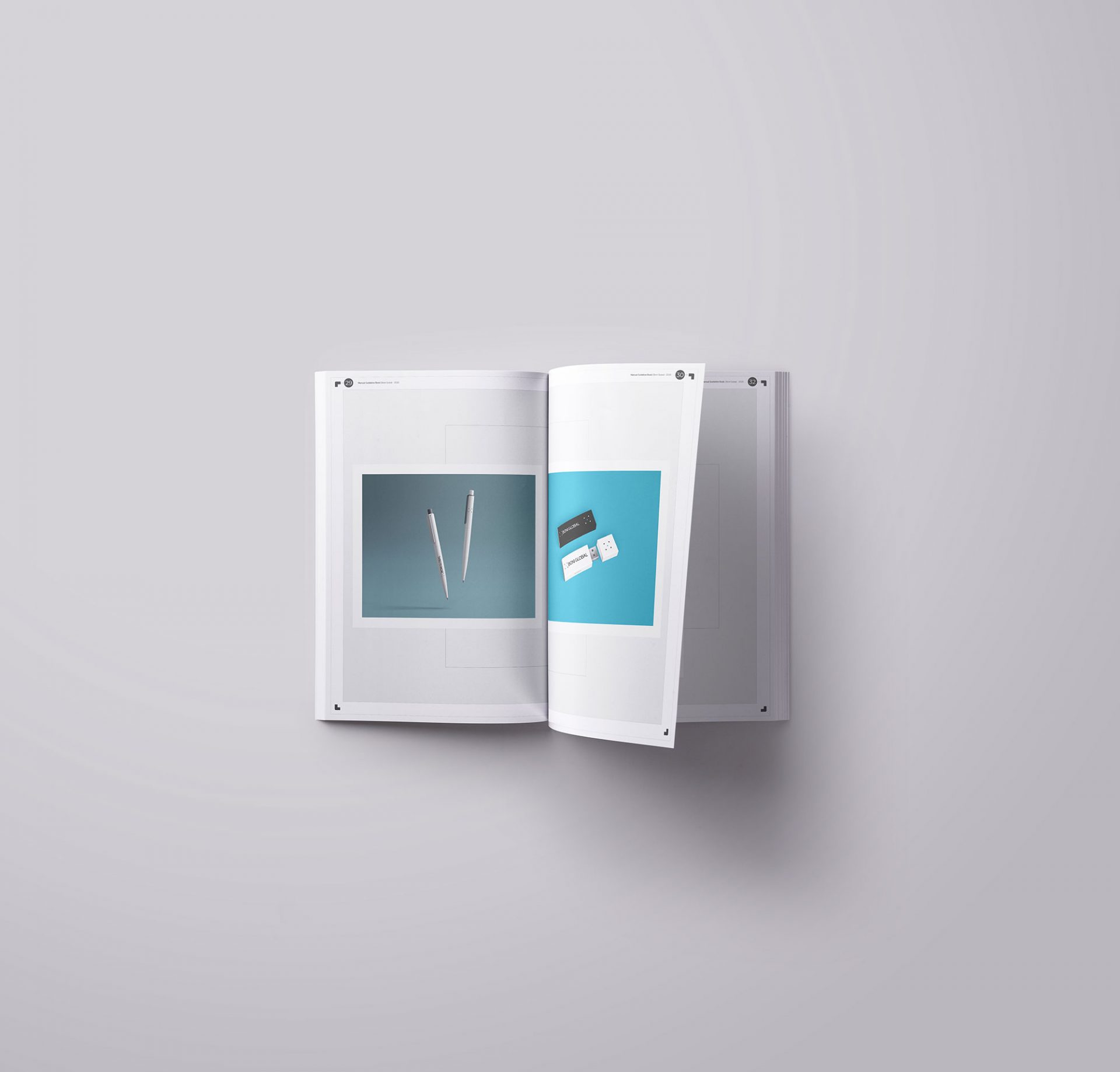
The logo is the key building block of the identity, the primary visual element that identifies a company. The signature is a combination of the the symbol itself and the company name – they have a fixed relationship that should never be changed in any way.
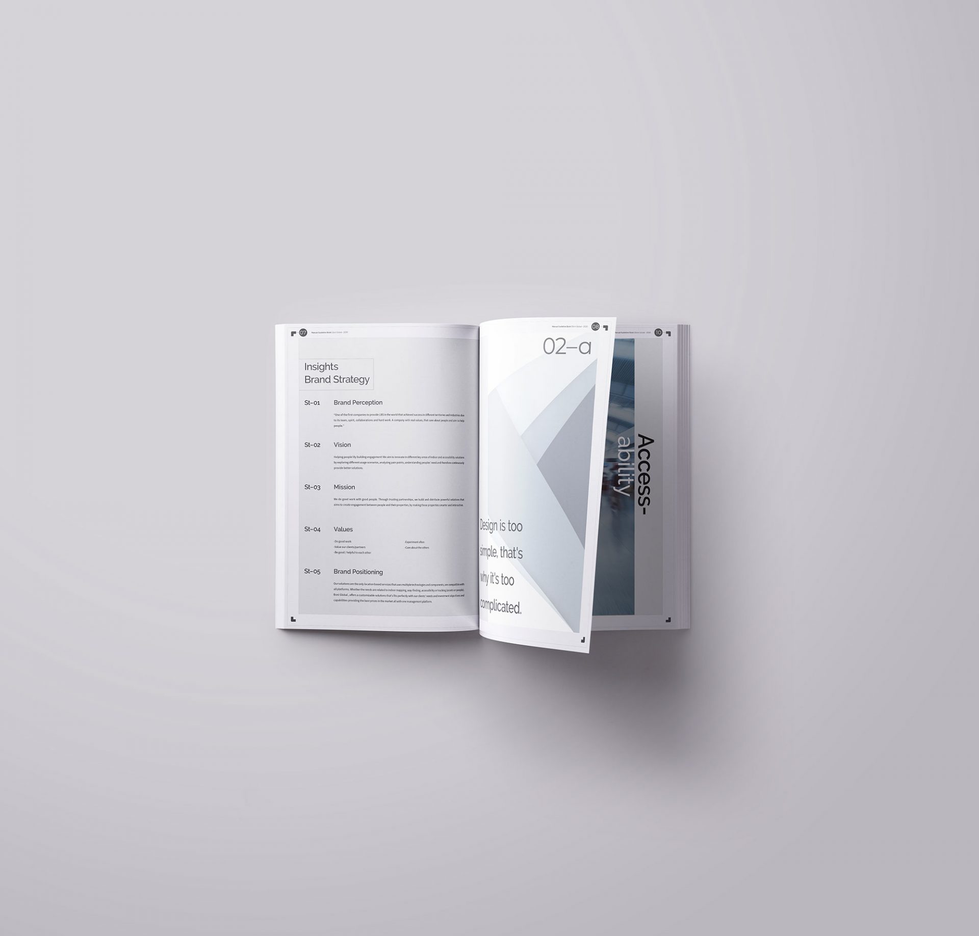
The logo proposal of Boni Global is based on 3 points. The first point is; explaining the mission of the company (way-finding, tracking, accessibility etc.). The second point emphasizes the identity (name). The third point highlights our territory and expansion.
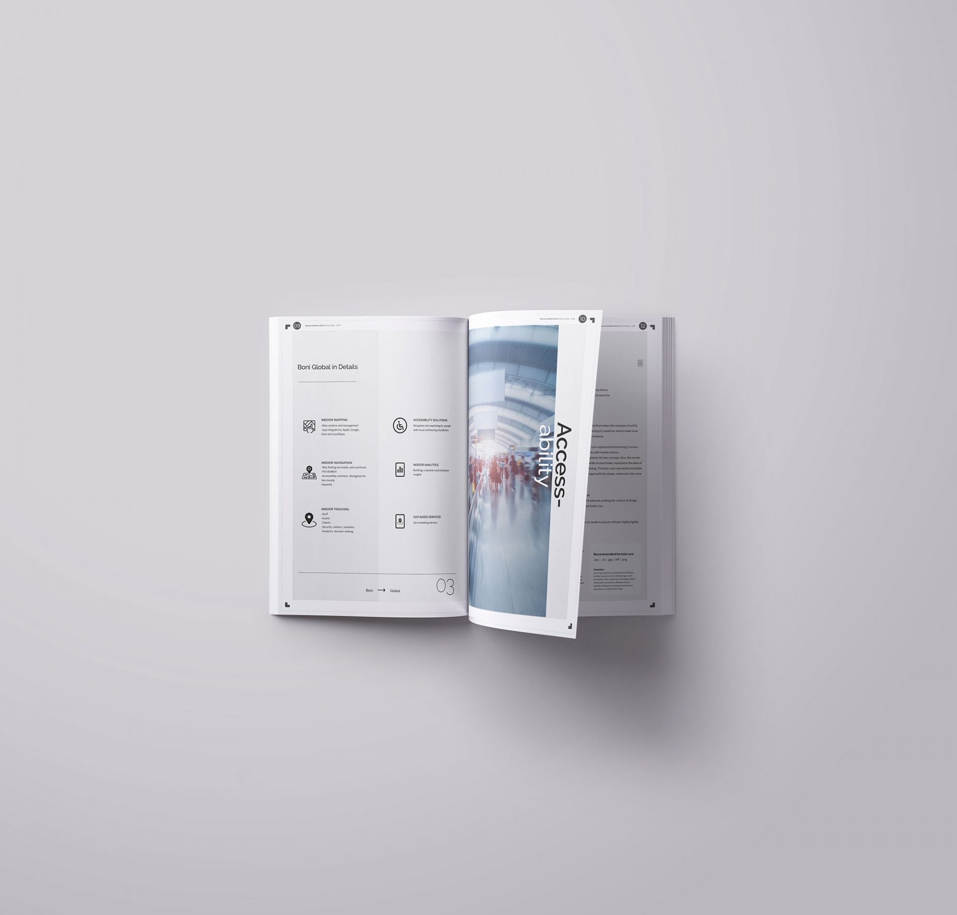
The focal point is view finder element which is placed on the left side. It has the centered icon with blue to emphasize the business that company deals with. The clarity of our vision which is based on the trust element that makes the company trustful, loyal and precise in delivering its solutions and to make view finder as key icon of the company.
5 corners of view finder icon represent human being’s senses. Since the company works with human senses, use of view finder completely fits into concept. Also, the corner that is placed in the middle of view finder; represents the idea of accessibility and way-finding. The blue color represents trustable and tech company, merged with the shape, centered in the view finder.
Project
Category
Year
Software Used